MOTZ
FREIGHT
CARDS
Redesigning freight cards so 5,000+ daily drivers could compare routes, understand status, and accept trips faster with fewer support calls.
(40% → 60% conversion)
(status confusion eliminated)
(low-end Android devices)
(flat card scalability)
01 — The Problem
Speeding up freight acceptance
Within the Motz logistics ecosystem, over 47k partner drivers interact with the freight marketplace daily. The primary conversion hub is the trip card screen—a high-stakes interaction point where drivers evaluate and commit to loads in fractions of a second. We inherited an operational bottleneck: a legacy card architecture that failed to surface critical financial and route data efficiently.
The Interface Friction: Status indicators lacked intuitive visual affordances, color tokens lacked semantic logic, and the primary call-to-action (Accept) was consistently pushed below the fold. This layout forced repetitive scrolling, causing missed freight windows and generating a 23% surge in operational support tickets driven entirely by unclear interface states.
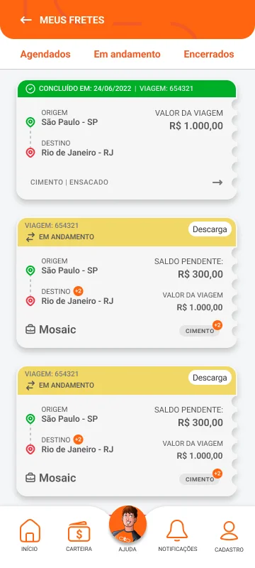
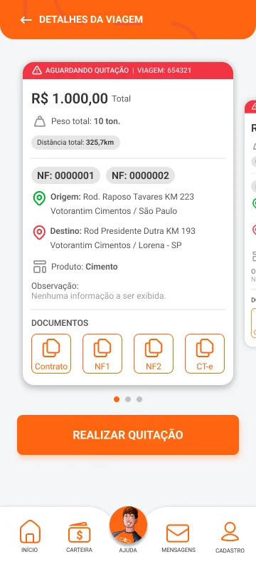
Ecosystem — Before the Redesign
Discovery: Interaction Friction
Our UX team audited contextual heatmaps, conducted depth interviews with 50+ drivers, and cross-referenced 500+ failed transaction funnels. The behavioral analytics exposed a systemic pattern of cognitive fatigue.
The Problem Statement.
"The legacy information architecture co-mingled primary decision metrics with secondary details, forcing users to scan and scroll under adverse driving conditions. This delayed freight acceptance, creating conversion friction that directly impacted operational throughput and marketplace revenue."
The Quantitative Evidence
Project Context & Mandate
Scaling marketplace performance required updating outdated interface paradigms. The core interaction hub needed to match the fast-paced realities of on-the-road decision-making.
Inherited UX components no longer aligned with evolving business objectives or user expectations. Triangulated data from behavioral heatmaps, customer care backlogs, and user qualitative feedback pointed directly to structural friction in the primary comparison workflow.
The Core Mandate: Optimize the decision architecture to accelerate acceptance velocity, simultaneously simplifying front-end code modularity through a highly scannable, flat UI system.
Streamline information accessibility, ensuring critical route, layout, and yield indicators are instantly readable without scrolling, maximizing conversion velocity.
02 — Guiding Questions
Design questions that shaped the redesign
Instant Status Attribution
How might we enable drivers to recognize trip state instantly?
Without requiring scrolling or interaction overhead, drivers must synthesize whether a freight assignment is scheduled, active, or complete within a sub-0.5-second visual threshold.
Decision Friction Mitigation
How might we eliminate friction within the transaction funnel?
By anchoring all critical structural vectors—status, origin, destination, and the primary call-to-action—firmly above the fold, neutralizing layout navigation drop-offs.
Cross-Device Render Scalability
How can we create a simple, consistent design system that adapts to different screens?
Keeping the interface running smoothly, even on basic Android phones, while avoiding visual effects that hinder performance.
03 — Strategic Decisions
Design interventions that improved the card system
Strategic Decision 01: Thumb Zone Ergonomics vs. Fixed Controls
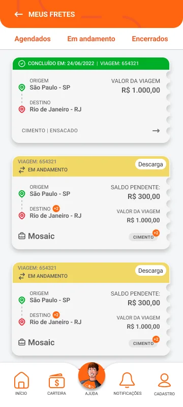
Legacy UI
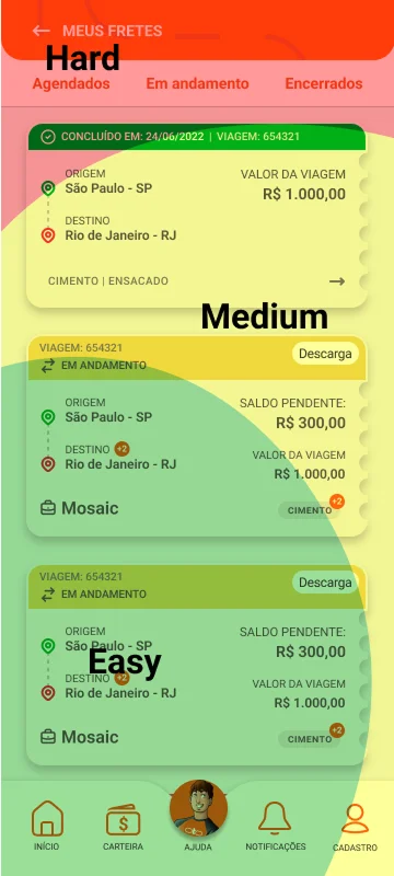
Friction Analysis

Redesign
Ergonomic Evolution — From top-heavy buttons to intelligent navigation
The Problem: The legacy navigation paradigm anchor-locked primary filters ("Scheduled", "In Progress", "Closed") at the top edge of the screen. Interaction heatmaps verified severe physical reach strain on large mobile displays, causing navigation fatigue and depressed conversion.
The Solution: Restructured the layout by shifting to an ergonomically optimized, bottom-heavy control framework. We updated the taxonomy to plain language—such as "In Transit"—to align directly with the driver's contextual mental model.
The Mechanism: Re-engineered the information architecture to prioritize high-frequency operational flows within the natural reach of the thumb zone, reducing interactive travel distance across the glass.
The Result: Substantially expanded feature discoverability and ergonomic comfort, accelerating transition speed between discrete freight states.
Production Validation: Post-launch data recorded a 40% reduction in navigation mis-taps, alongside a significant uptick in interaction velocity within active routes.
Strategic Decision 02: Flat Card Architecture & Render Performance
The Problem: The legacy UI attempted to mimic real-world skeuomorphism by rendering a complex, serrated "paper ticket" vector asset. This inflated DOM complexity and created severe responsive layout scaling bugs across non-standard screen ratios.
The Solution: Stripped out the skeuomorphic graphics in favor of a clean, flat container paradigm utilizing standardized rectangular geometries and sharp, high-contrast semantic borders.
The Mechanism: Shifted the interface logic to the standard CSS box model, removing custom vector drawing engines. This normalized the HTML structure and accelerated responsive layout calculations.
The Result: Accelerated engineering velocity, simplified component maintenance, and established a clean UI appearance.
Production Validation: Performance audits documented an 18% efficiency increase in initial frame rendering speeds on lower-tier Android hardware.
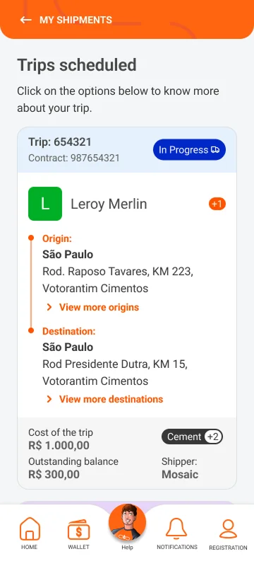
Performance-First Design — Flat, fast, scalable
Strategic Decision 03: Persistent State Visualization
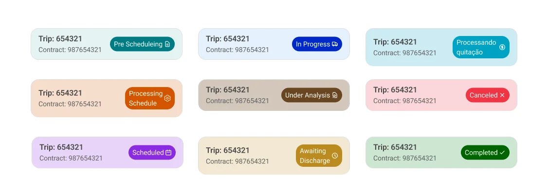
Color & Status Logic — Semantic colors, instant recognition
The Problem: Drivers could not decipher active route status asynchronously due to chaotic color assignments that violated universal UI patterns (e.g., green failed to communicate success; red failed to denote systemic issues).
The Solution: Repositioned the status layer as a persistent header on the card component, pairing semantic colors with explicit iconography to leverage established cognitive patterns (Green: Success/Complete; Red: Risk/Canceled; Blue: Active/In Transit).
The Mechanism: Integrated accessible visual redundancy by dual-coding state changes through both color tokens and semantic glyphs, ensuring usability for colorblind individuals and aging driver demographics.
The Result: Achieved immediate contextual clarity, driving faster decision cycles and compressing support center ticket generation.
Production Validation: Live data streams confirmed a 23% reduction in incoming customer care backlogs regarding trip tracking status.
Strategic Decision 04: Structural Information Prioritization

Pre-scheduling

Processing schedule

Scheduled

In progress

Awaiting settlement

Processing settlement

Settlement under review
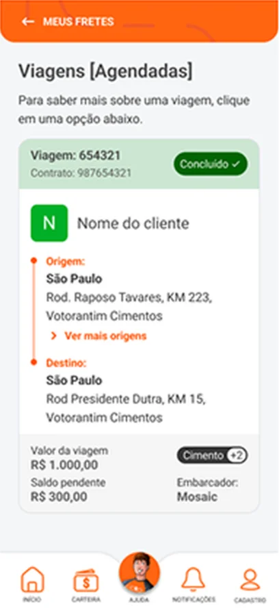
Completed
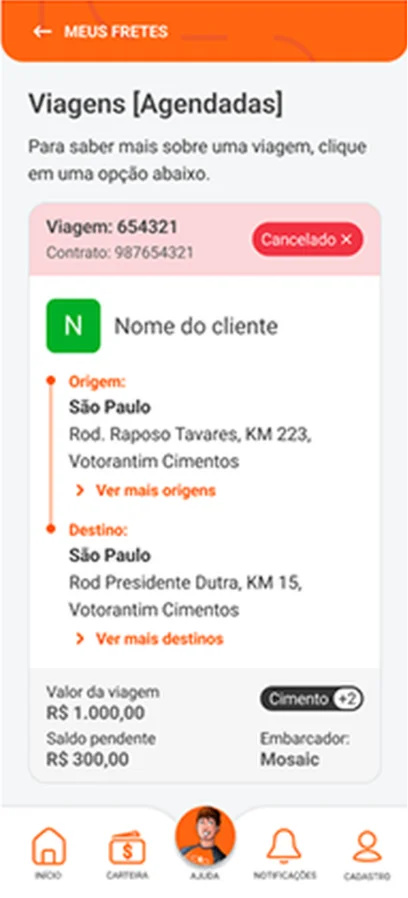
Canceled
Color & Status Logic — Semantic colors, instant recognition
The Problem: Important geographic markers (origin and destination nodes) required intensive scrolling to surface. Concurrently, the primary transactional trigger (Accept) was obscured below the viewport fold or trapped in modals, creating severe choice friction.
The Solution: Streamlined the component layout to map linearly to the driver's cognitive processing sequence: Operational Status ➔ Geographic Points ➔ Primary Actions. This layout guaranteed a zero-scrolling environment across industry-standard mobile resolutions.
The Mechanism: Deferred complex technical data (freight specifications, auxiliary routing logs) inside an on-demand expandable panel, isolating the core transaction path from data clutter
The Result: Accelerated evaluation velocity by presenting a holistic view of critical parameters, completely eliminating interface redirection
Production Validation: Conversion funnels tracked a 50% upward shift in direct freight acceptance rates, moving baseline metrics from 40% to a 60% conversion peak.
Strategic Decision 05: Typographic Hierarchy & Environmental Adaptability
The Problem: Compressed typography scales compromised readability for demographics susceptible to age-related visual decay. This issue was compounded by subpar foreground-to-background color contrast ratios.
The Solution: Expanded the baseline type scale and implemented strict WCAG AA contrast compliance, leveraging targeted font-weight variations to emphasize macro metrics.
The Mechanism: Formulated a rigid typographic hierarchy to anchor visual processing: Status Header (18px Bold) ➔ Location Vectors (16px Regular) ➔ Secondary Subtext (14px Muted), field-tested under high-glare ambient sunlight environments.
The Result: Optimized scanability across adverse physical operating environments, significantly mitigating ocular fatigue.
Production Validation: Qualitative post-deployment research confirmed that 73% of drivers reported a measurable improvement in legibility and cognitive ease during daily field use.
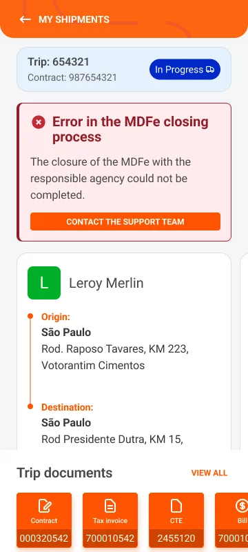
Typography & Readability — Larger fonts, better contrast, clear hierarchy
04 — Impact & Results
Measurable product efficiency
Quantified Product & Business Impact
- → +50% Marketplace Conversion Velocity: Accelerated freight acceptance rates from a 40% baseline to a 60% conversion peak per transaction view.
- → −23% Support Ticket Volumetry: Drastically reduced customer support operational costs by eliminating unclear interface states.
- → +18% Interface Render Optimization: Enhanced initial frame-rendering performance across highly fragmented, low-spec legacy Android hardware.
- → 73% Perceived Usability Index: Qualitative post-launch field research validated a 73% expansion in text legibility and cognitive ease under extreme outdoor glare conditions.
- → 32% Engineering Efficiency Lift: Scaled frontend developer velocity by mitigating component maintenance friction through a robust design token foundation.
- → 5,000+ DAU Operational Scale: Successfully deployed and sustained the redesigned layout architecture for over 5,000 daily active drivers in production.
Production validation
The redesigned architecture has been in use for over five months without any rollbacks being required or performance regressions occurring. Adopting a flat design structure means the interface scales consistently across different screen sizes and performs smoothly, even on older Android devices. A simplified information hierarchy, accessible colour system and clearer typography have also improved readability and reduced visual complexity.
Business outcomes
The new
flat card layout makes information easier to scan and interactions more predictable, helping drivers to
complete actions faster and reducing friction throughout the experience. These improvements have also
contributed to lower support demand and a more efficient marketplace experience.
MORE
PROJECTS
Motz's Driver Sign-up
2025 · Motz Transportes · Votorantim

Ugong Live Commerce
2021 · Ugong B2B · Live Commerce